
Data Visualisation supports evidence-based publishing decisions
There is no shortage of data about journal articles. Traditional citation and usage measures are now complemented by alternative metrics. In the past, some of this information could be brought together with considerable investment, specialised expertise - and a lot of time. Driving innovation and growth in a mature market requires more sophisticated market intelligence, broader data sets and sophisticated analytics.
A successful visual analytics platform transforms data into interactive visuals that offer a faster 'at a glance' understanding of trends and outliers. Direct access to the source data is also critical to follow principles of transparency and reproducibility expected by our communities. The user interface is designed to combines visualisations with multiple data streams in a simple way to help users investigate their own questions - without special technical skills and in a lot less time. Data visualisation reveals effects of new publishing models, the influence of competing publications, results of new programme policies, and market conditions.
A data visualisation platform delivers faster, deeper insights into the health of a journal programme, without the data wrangling, SQL queries and pivot tables. When creating accessible and actionable visualisations, here are three keys to success:
- Expertise of the platform development team. A deep understanding of the questions publishers need to answer and the best data sets and sources are essential to source data, design architecture and algorithms, and shape the visual language.
- A customer-centric development process. By directly engaging data scientists and publishers to interact with prototypes, the platform development team can observe and learn what users want to see, how it would be best presented, and what the next question is. The process is iterative and prioritises customer recommendations.
- Robust, adaptable technology solutions. The hardware, architecture, data warehouse, and data visualisation platform must deliver a fast response time in real-time or with user-identified triggers and thresholds.
Validating and challenging editorial instincts
Journal editors and publishers have market insights and informed instincts about their research discipline, but as researchers, editors also appreciate that biases can influence perceptions. They may ask whether their assumptions are valid. Are we rejecting articles that go on to be highly cited? What journals are they published in, if at all? Are these articles more likely to be in a specific discipline?
Editors may have intuition about where authors are most likely to submit, but these may not hold true in a changing landscape with new journals and open access requirements. Or perhaps the analysis has never been done. Getting answers based on current data is far preferable to the frustration of ‘known unknowns.’ The answers can confirm instincts or challenge assumptions.
By integrating data streams from a publisher’s manuscript system with multiple sources for citation, usage, and alternative metrics data, publishing decisions can be analysed at the article, journal, and programme level. Publishers can identify valued content, topics, and trends by looking at the health of citations, usage, and awareness simultaneously.
When developing Vizors, the visual analytics platform from HighWire Press, pilot participants identified many questions that could help them assess the health of their programme and consider strategies for growth. Here are a few examples:
How do we identify top global authorship?
Editorial boards seek top global authorship across disciplines. They may need to expand the board to include editors from other regions to increase global reach. Using country data from a manuscript system with citation and usage data, it is possible to identify top authors and topics of focus by region. This evidence can inform invitations to prospective editorial board members or engage these authors in other ways to support programme growth. The analysis can help board members reach prospective authors outside their networks to find top authors.
Are we publishing novel and definitive papers?
Editors may seek to be more selective in the papers considered for peer review during a journal’s lifecycle. Important questions include: What change in citation trends are predicted if we are successful? To what degree and how quickly are we seeing an impact of our changed approach?
The expected result is an increase in the proportion of papers that are more highly cited and a reduction of papers that are not cited as highly in the first year. To illustrate the results of the editorial direction, normalising the data is essential – allowing comparisons of citation data for equivalent time periods. For example, citation analysis may look at only the first 12 months of citations for articles published in a given year, regardless of when in the year they were published. The data visualisation below from Impact Vizor illustrates the increase in the proportion of articles that were more highly cited (11+ citations). In the same time frame, the number of articles with fewer than 6 citations also steadily declined. The visualisation also normalises the number of articles published per year.
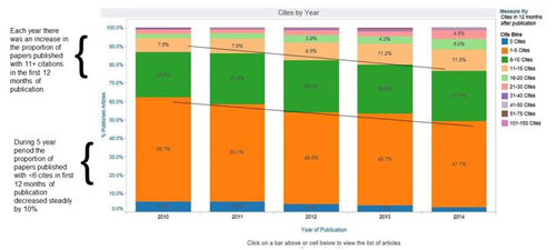
While this looks like a simple Excel bar chart, there is another level of data. Clicking on the blue 'bin' provides transparent access to the data source – a list of articles of the articles – to answer the obvious question, 'What papers were not cited at all in the first year of publication?' Revealing data in layers helps simplify views of complex data. Each visualisation is designed to illustrate the key data for that view. Filtering citation data by article type or table of contents section requires a different design.
Can we avoid surprises when Journal Impact Factors are announced?
When launching a new journal, there may be a perceived benefit of an ‘early Impact Factor'. Before applying, an editor or publisher may want to model the potential Impact Factor based on the existing citation trends and the article pipeline.
For established journals, a granular analysis of articles and citations is more useful in assessing the publishing decisions than the Journal Impact Factor itself. Publishers and editors want to understand differences by topic, article type, and consider differences in open access and subscription publications. A faster way to identify the highly cited articles that will 'age out' helps publishers anticipate change and answer predictable questions.
A data visualisation platform saves time and delivers better, faster answers
A data visualisation platform saves hours of staff time. The platform should support the curiosity of editorial board members, managing editors, sales managers and marketers, analytics teams, and consultants. At editorial board meetings, questions often arise which would seem to be answerable, if it didn’t take so long to assemble the data, design a query, and create the report output. With a data visualisation platform, once data feeds are established, someone on the team who is familiar with the right data may be able to answer the question during the meeting. The visualisation can go live on the projector to support the explanation. When evidence and the data is only a click away, debates may be settled, a decision agreed, and an action plan created.
Keith Gigliello, American Society of Hematology and John Sack, HighWire Press discuss data visualisation, article-level impact, and strategic insights in an on-demand webinar.